Pantsuit: The Hillary Clinton UI pattern library
Building a (presidential) design system
Published on — for Git Out The Vote
Design systems. Pattern libraries. Styleguides. Whatever you want to call them, they are very much in style right now.
A design system’s purpose is to provide consistent, tested and reusable solutions for a common UX problem.
Campaigns move at lightning speed, and have some hard, non-negotiable deadlines. To empower our developers to create and ship products at the pace our needs require while maintaining a consistent UI, a single, unified design system was needed.
Thus, Pantsuit was born.
Pantsuit is Hillary for America’s internal design system. Its primary goal is to serve as a single source of truth for the design and front-end teams. My job is to make sure the system is modular and flexible enough to be used in any number of unpredictable ways.
The first version of the system was created for, and is still used by, our donations platform. Its purpose was to achieve a 1:1 UI parity of the live site while completely rewriting the underlying code base.
When the time came for a redesign of hillaryclinton.com, I was charged with creating a new version of Pantsuit while simultaneously building the new site.
This system isn’t perfect, and is by no means dogmatic. It’s simply what has worked for us given the pace and scope of the work we do.
Modular architecture
The core CSS architecture of Pantsuit is based around a combination of SMACSS and Harry Roberts’ ITCSS, along with his brilliant namespacing patterns.
Each class name is prefixed with an indicator of that class’ purpose and scope, based on the ITCSS inverted triangle.
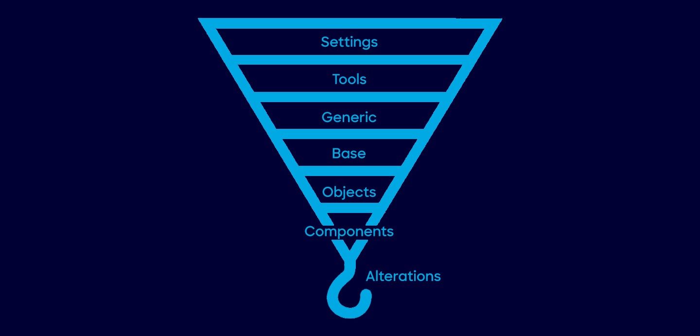
.o- // an object, an unstyled design pattern
.c- // a component, a styled piece of UI
.a- // an alteration, an UI-independent override
.t- // a theme, change UI appearance based on theme
.is-, .has-, .for- // state-based styles
.js- // used for binding behavior to components
In each layer of the inverted triangle, the scope of the styles get narrower and more specific. At the bottom of this is a layer of utility or helper classes, referred to as “trumps”, that contains high-specificity selectors. We use these selectors to make very targeted alterations to existing components, and shouldn’t be overridden. As such, they often use !important to ensure the desired alteration is achieved, such as .u-no-margin { margin: 0 !important; }. However, for obvious reasons, I refuse to call them “trump” classes. Instead, I refer to these classes as “alterations.” So .u-no-margin becomes .a-no-margin.
Aside from some high-level styling on HTML elements, our system consists of these type of class-based selectors. This markup-independent approach allowed us to solve an unique problem. In particular, it gave us the tools to style the same collection of components with the same markup, differently based on its position in the DOM.
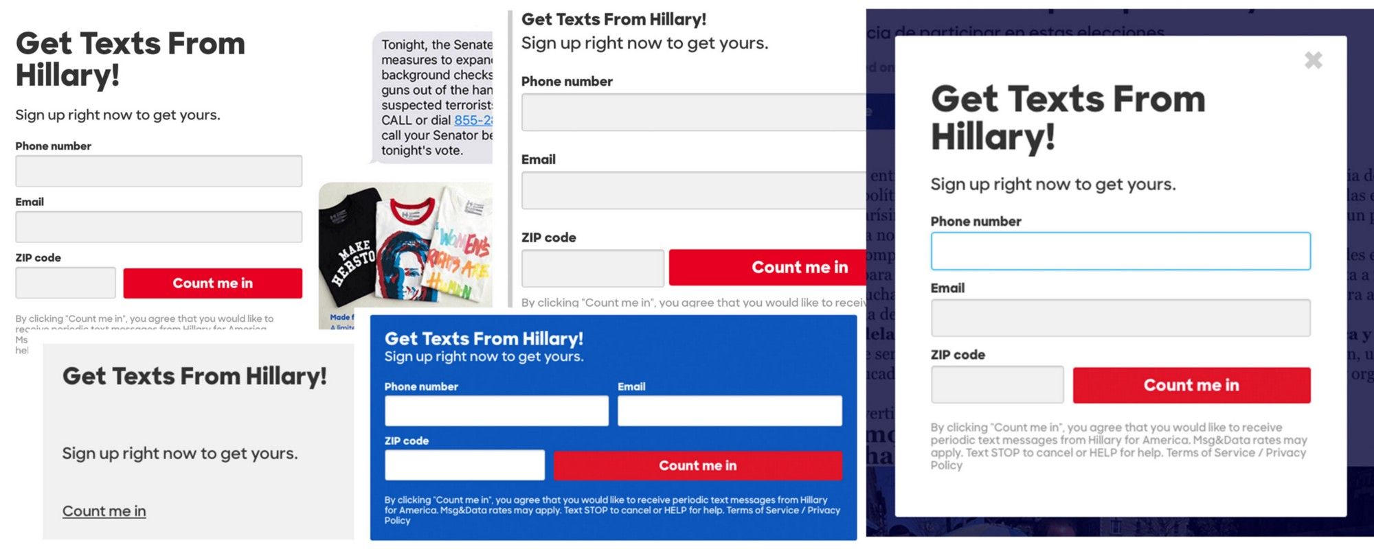
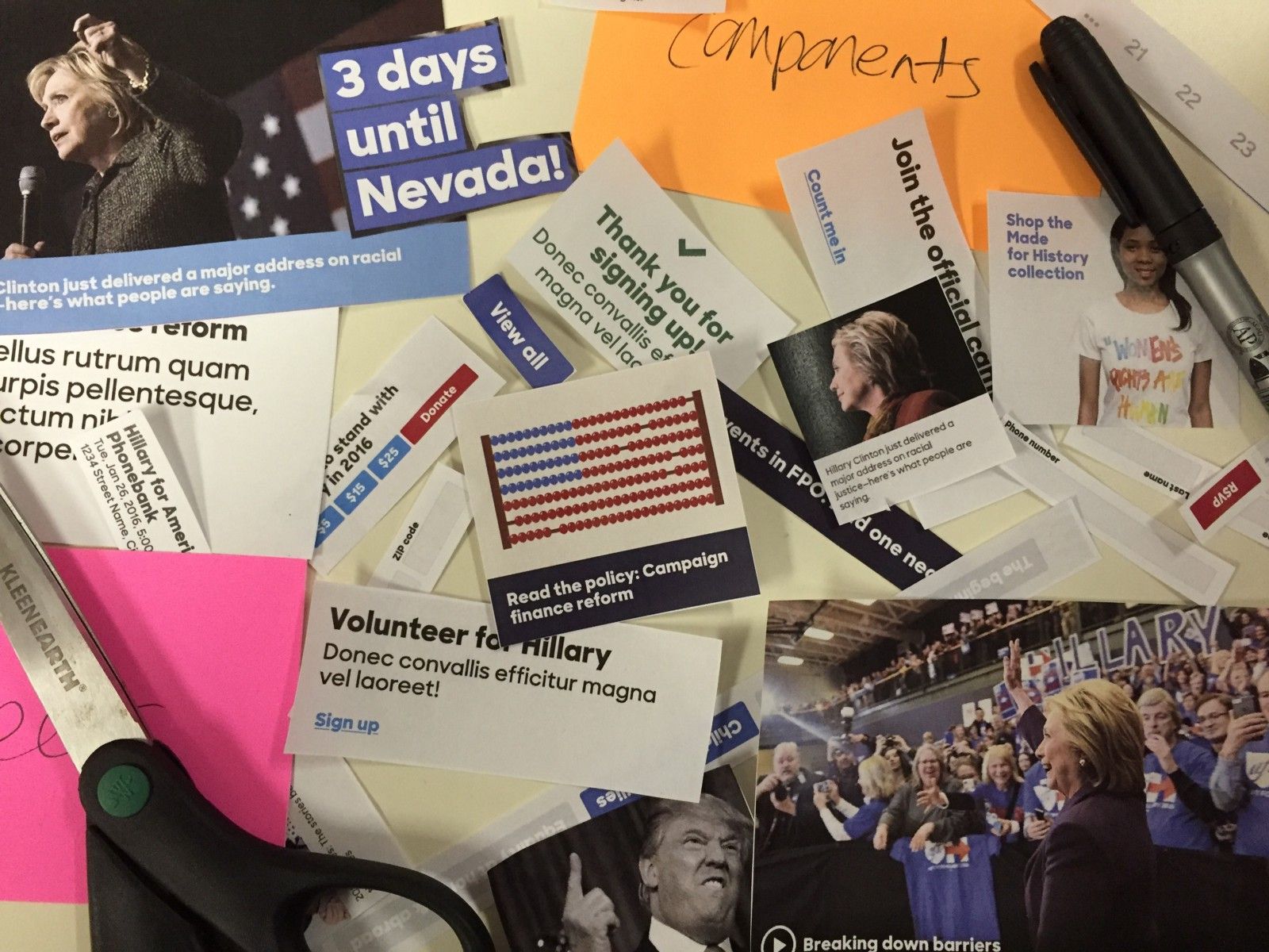
For example, each of these call-to-action forms have the similar markup, with the main difference being their location on the page. The styling and layout of the form elements change based on the container the form is placed in. This is in addition to some base-level styling on the inputs and buttons to achieve consistency.
A more inclusive system
From the beginning, creating an inclusive experience was a purposeful goal of both the new website, and the new design system. Our primary focus was to be WCAG 2.0 AA compliant in terms of keyboard accessibility and color contrast, and to use accurately semantic HTML.
One easy step towards achieving compliance was to ensure that the content of each page was in logical order. With that in mind, I made the decision to decouple the sizing of headings from the elements. This means that h1, h2, etc, have no sizing associated with them. Instead, the typographic scale is scoped to classes such as .c-headline-alpha. This ensures that headings are used for semantic, hierarchical purposes and not to achieve a specific font size. Using the correct HTML elements alone addressed a large portion of our accessibility needs.
To make sure that color-blind and low-vision users could easily see our content, the design team made some adjustments to our initial color palette to provide better contrast between background and text elements.
In addition to proper use of hierarchy and contrast, we implemented separate focus states from hover states to provide keyboard-only users the visual feedback they need when navigating a page.
Of course there’s still work to be done, but the initial feedback has been positive.
Documentation
A design system is only as good as its documentation, so it was really important that I created a site that was both easy for my team to use and for me to keep updated. We use a combination of assemble, kss-node and nunjucks to document Pantsuit.
KSS-node parses the comments in the code and generates markup based on the actual styles of your system. As the styles are updated, so is the documentation.
// Button
// Buttons can and should be clicked. Buttons come in two sizes, small and large. To create a large button, add a class of \`c-button-large\`. To create a link that looks like a button, add the \`c-button-link\` class.
// .secondary — Use to indicate a secondary call-to-action.
// Markup:
// buttons.html
// Styleguide 5.button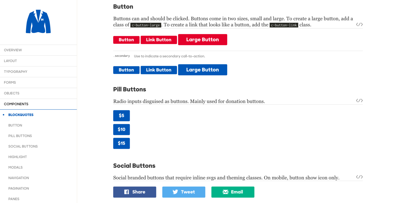
What’s next?
There’s less than 3 months left and we’re just getting started. There’s still time to join this crazy journey. Want to solve real problems and help elect the next President of the United States? Join our team of volunteers.