I also love design systems work. It gives hybrids like me a home. It seems like everyone is talking about design systems right now. Design systems teams are perfect for those who enjoy doing architectural work and who straddle the line between designer and developer.
Una Kravets recently identified some of the reasons that design systems fail, and chief among them are lack of buy-in, underlying architecture, and communication. While it’s definitely easier to establish these before project work begins, that doesn’t mean it is the only path to success.
It’s a privilege to work on a greenfield project, and one that is not afforded to many. Companies with complex and/or legacy codebases may not be able to support a full rewrite of their product. In addition, many people feel overwhelmed at the thought of creating a complete system and are at a loss of how or where to even begin the process.
This is where refactoring comes into play.
According to Martin Fowler, “refactoring is the process of changing a software system in such a way that it does not alter the external behavior of the code yet improves its internal structure.” It’s largely invisible work, and if you do it right, the end user will never know the difference. What it will do is provide a decent foundation to begin more systematic work.
When I was first asked to create Pantsuit, the design system for Hillary for America, I was tasked with changing our codebase to be more modular and scalable, without changing the behavior or visual design of the UI. We needed a system in place that would allow for the rapid creation of new projects while maintaining a consistent visual language. In essence, I was asked to refactor our code into a design system.
During that refactor, I focused the majority of my efforts on creating a scalable architecture based on the UI components in a single workflow. Since I needed to maintain a 1:1 parity with production, the only changes I could create were under-the-hood. I started with writing coding standards and deciding on a CSS architecture that I would then use as I rewrote sections of the codebase.
If you already have these in place, great! If not, then this is an excellent place to start. Even if your dream of a design system is never fully realized, having a coding philosophy and architecture in place will still have far-reaching benefits and implications.
I want to note that if your refactor includes creating new coding standards or a CSS architecture, don’t try to switch everything over right away. Instead, focus on a single new feature and isolate/encapsulate your work from the rest of the codebase.
The key principle to cleaning up a complex codebase is to always refactor in the service of a feature. - Max Kanat-Alexander
Refactoring for the sake of refactoring can easily lead to accusations of misused time and lack of results. Another danger of refactoring is that it can turn into yak-shaving if you aren’t disciplined in your approach. To that end, tying your refactored components to feature work is a great way to limit scope and reduce the rest of unintended changes.
For example, the initial work on Pantsuit focused only on components related to the donations flow. Every line of code I wrote was in service to improving the maintainability and modularity of that UI. Because we didn’t have any standards in place, I started with those. From there, I identified all the components present in every step of the donations flow, which included some type styles, buttons, form inputs and error states. Then came the refactor of each individual component. Finally, I reintegrated the newly refactored components into the existing donations flow and tested it against production, checking for visual and behavioral diffs. At the end of this process, I had the beginning of a design system that would grow to serve over 50 applications, and a case study to demonstrate its effectiveness.
Ideally, you’ll want to get buy-in from your stakeholders and product owners before you begin any design systems work. However, in the absence of buy-in, linking your work to new feature development is a good way to both limit the scope of your refactor and jump start component creation.
In addition, if you’re still trying to convince your team of the benefits of a design system, starting small and using the newly refactored, feature-driven work as a case study is one way showcase a design systems’ value. By providing a concrete example of how working towards a design system contributed to the project’s success, you’re gathering the data necessary to secure buy-in for a larger-scale effort. It’s a great way to show value, rather than just talking about it.
Perhaps the most important thing you can do for any design system is to document it. The key is to create a frictionless way to keep the documentation up-to-date, otherwise no one will contribute to it, and in turn, it will become obsolete and useless.
There are lots of tools out there to help you get started documenting your new system. One of my favorites is KSS, which parses comments in the code and uses them to generate a style guide. For Pantsuit, I used the node version of KSS, along with a template to quickly spin up a documentation site.
I’ve listed just a few tools below; for even more, check out the tools sections of styleguides.io.
Regardless of what tool you settle on, it needs to integrate well with your current workflow.
If you’re not lucky enough to be able to start a new design system from scratch, you can start small and work on a single feature or component. With each new project comes a new opportunity to flesh out a new part of the system, and another potential case study to secure buy-in and showcase its value. Make sure to carefully and thoroughly document each new portion of the system as it’s built. After a few projects, you’ll find yourself with a decent start to a design system.
Good luck, and happy holidays!
In August, we released a major redesign of slack.com, and we want to give you a peek behind-the-scenes. Rebuilding our marketing website was a massive project that took careful coordination across a variety of teams, departments, and agencies.
We implemented a redesign while overhauling all the under-the-hood code. Our aim was to address a few goals at the same time: deliver a consistent rebranded experience while tackling critical improvements to site architecture, code modularity, and overall performance and accessibility. This would afford us a new foundation for several important company initiatives, including internationalization.
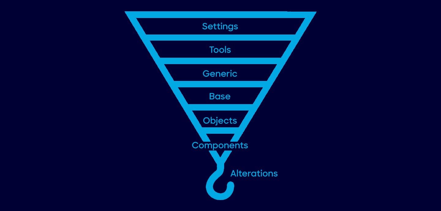
The old slack.com shared many code and asset dependencies with our web-based Slack client. One of our earliest goals was to decouple the website from the “web app” in order to streamline and simplify our codebase. By including only what we need to run slack.com, we are able to increase site stability, reduce developer confusion and create a codebase that is easier to iterate on. A fundamental part of this effort was the creation of our new UI framework, called :spacesuit: 👩🏾🚀.
The :spacesuit: framework consists of class-based, reusable components and utility classes used to standardize our marketing pages. It allowed us to reduce our CSS payload, in one case by nearly 70% (from 416kB to 132kB).
Some other interesting data points:
Our CSS is organized based on the ITCSS philosophy and uses BEM-like naming conventions. Selectors are named using a single-letter prefix to indicate the type of style the class represents. The prefix is followed by the name of the component and any variation applied to it. For example, u-margin-top--small
represents a utility class that sets margin-top
to the small value set by our variables. Utility classes such as these are an essential part of our system as it allows our devs to fine tune pieces of UI without having to rewrite a lot of CSS. In addition, spacing between components is one of the tricker parts of creating a design system. Utility classes such as u-margin-top--small
let us create consistent spacing and eliminate the need to reset or undo any spacing already applied to a component.
The new site uses a combination of Flexbox and CSS Grid to create responsive layouts. We wanted to utilize the latest CSS features, while also ensuring that visitors with older browsers received a comparable experience.
At first we tried to implement our layout with a traditional 12-column grid using CSS Grid. That approach ultimately didn’t work because we were limiting ourselves into a using a single dimensional layout when Grid is meant for two. In the end, we discovered that a column-based grid wasn’t actually needed. Since Grid allows you to create a custom grid to match whatever layout you have, we didn’t need to force it into 12 columns. Instead, we created CSS Grid objects for some of the common layout patterns in the designs.
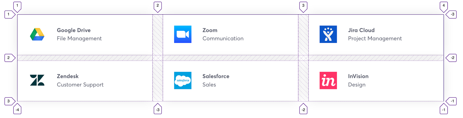
Some of the patterns were pretty simple.
Others were more complex, which really showcased Grid’s abilities.
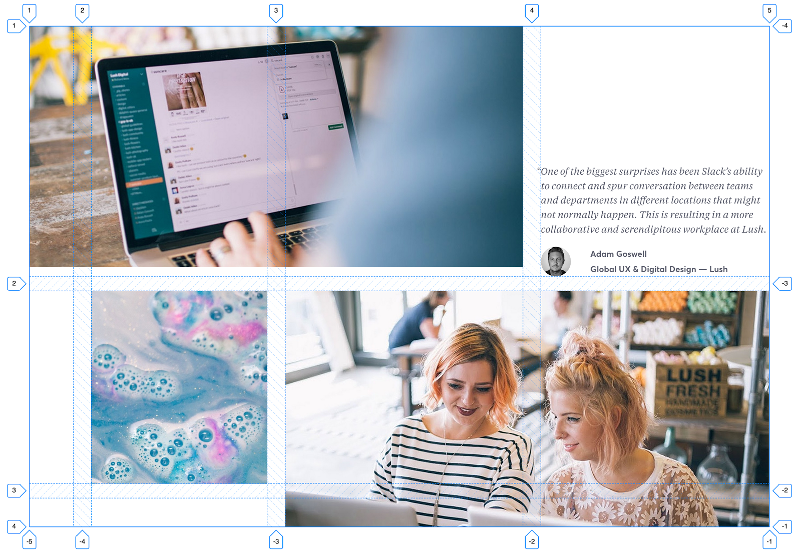
Before our Grid implementation, a layout like the one above required lots of wrapping, and sometimes empty, divs to mimic a two-dimensional grid.
<section class=”o-section”>
<div class=”o-content-container”>
<div class=”o-row”>
<div class=”col-8">…</div>
<div class=”col-4">…</div>
</div>
<div class=”o-row”>
<div class=”col-1"></div>
<div class=”col-3">…</div>
<div class=”col-8">…</div>
</div>
</div>
</section>
With CSS Grid, we’re able to remove the extra markup needed to simulate a grid, and simply create one natively. Starting with Grid lets us use less markup, in addition to making sure the markup we use is semantic.
<section class=”c-photo-collage c-photo-collage--three”>
<img src=”example-1.jpg” alt=””>
<img src=”example-2.jpg” alt=””>
<blockquote class=”c-quote”>
<p class=”c-quote\_\_text”>…</p>
</blockquote>
<img src=”example-3.jpg” alt=””>
</section>
At first we used Modernizr to detect Grid support, however that resulted in flashes of unstyled layout while the library loaded.
We decided that addressing the jarring experience of the layout shift was a higher priority than backwards compatibility. The compromise was to use CSS Grid as an enhancement and fallback to Flexbox and other techniques when needed.
Instead of using a library to detect Grid support, we went with CSS feature queries. Unfortunately, feature queries aren’t supported in every browser. This means that any browser that can’t handle the @supports
rule will not get the CSS Grid layout, even if that browser supports Grid. So IE11, for example, will always use our Flexbox-based layout even though it supports some Grid features.
We use some features of Grid that aren’t currently fully supported in all browsers, the most notable being percentage-based grid-gap
. Although support for this has been implemented in some versions of Safari, we still needed to anticipate its absence. In practice, a Grid object is styled as follows:
@supports (display: grid) and (grid-template-columns: repeat(3, 1fr)) and (grid-row-gap: 1%) and (grid-gap: 1%) and (grid-column-gap: 1%) {
.c-photo-collage {
display: grid;
grid-gap: 1.5rem 2.4390244%;
}
.c-photo-collage > :nth-child(1) {
grid-column: 1 / span 3;
grid-row: 1;
}
.c-photo-collage > :nth-child(2) {
grid-column: 2;
grid-row: 2;
}
.c-photo-collage > :nth-child(3) {
grid-column: 4;
grid-row: 1;
align-self: flex-end;
}
.c-photo-collage > :nth-child(4) {
grid-column: 3 / span 2;
grid-row: 2 / span 2;
}
};
Any browser that doesn’t meet the query requirements will use our flexbox fallbacks instead.
@supports not ((display: grid) and (grid-column-gap: 1%)) {
/\* fabulously written CSS goes here \*/
}
Once we had responsive layouts, we needed equally adaptable typography. We created Less mixins to help us fine-tune our typesetting. Typeset is a mixin that acts as single source of truth for all typography settings. For each type style, a new line is created inside the mixin that contains the name or purpose of the style, followed by a list of settings for each style. They are, in order: font-family
, min and max font-size
(in rems by default), line-height
, font-weight
, and any text-transforms
, such as uppercase
. For clarity, each type name is prefixed with display-as-
to make its purpose plain.
Here’s a simplified version of the mixin:
.m-typeset(@setting) {
@display-as-h1: @font-family-serif, 2, 2.75, 1.1, @font-semibold;
@display-as-btn-text: @font-family-sans, .9, .875, 1.3, @font-bold, ~”uppercase”;
font-family: extract(@@setting, 1);
font-weight: extract(@@setting, 5);
line-height: extract(@@setting, 4);
}
See it in action:
.c-button { .m-typeset(“display-as-btn-text”); }
The logic for this mixin takes a parameter, such as display-as-btn-text
, and extracts the settings from the list at the index indicated for each property. In this example, the line-height
property would be set to 1.3 because it is the 4th indexed value. The resulting CSS would be
.c-button {
font-family: ‘Slack-Averta’, sans-serif;
font-weight: 700;
line-height: 1.3;
text-transform: uppercase;
}
Alice Lee provided us with some beautiful illustrations, and we wanted to make sure we showcased them in the best possible light. Sometimes it was necessary to display a different version of an image depending upon the viewport width. We toggled between retina vs. non-retina assets, and made image adjustments for specific screen widths.
This process, also known as art direction, is accomplished by using the picture
and source
elements with Picturefill as a polyfill for older browsers. Defining characteristics, like device size, device resolution, orientation allows us to display different image assets when the design dictates it.
With these tools, we were able to display the best possible version of an asset based upon query parameters we set. In the above example, the main hero image needed a simpler version for a smaller viewport.
<picture class=”o-section_illustration for-desktop-only”>
<source srcset=”/img/features/information/desktop/hero.png” sizes=”1x, 2x” media=”(min-width: 1024px)” alt=””>
<img srcset=”/img/features/information/mobile/hero.png” sizes=”1x, 2x” alt=””>
</picture>
This technique allows us to specify which image asset is shown for a particular media query, plus if retina and non-retina assets are needed and available. The end result is greater art direction throughout the site.
Another major goal was to ensure that low-vision, screenreader and keyboard-only users could navigate the site with ease. While starting from a clean codebase, we were able to make many impactful improvements to color contrast, semantic HTML and keyboard accessibility with little additional effort. Additionally, we were able to work in some new features for a more accessible experience. We added a skip link before the navigation so that users could bypass the menu if desired. For a better screenreader experience, we added an aria-live region and helper functions to announce form errors and route changes. In addition, interactions are keyboard accessible with noticeable focus states. We also strived to use clear, descriptive alt text.
There are always more wins to be had for better performance, maintainability and accessibility. We are refining our site telemetry to better understand where the bottlenecks lie and where we can make the most impact. We’re proud of the progress we have made; progress that will surely serve us well as we look to create a more pleasant experience for our customers around the world.
]]>Design systems. Pattern libraries. Styleguides. Whatever you want to call them, they are very much in style right now.
A design system’s purpose is to provide consistent, tested and reusable solutions for a common UX problem.
Campaigns move at lightning speed, and have some hard, non-negotiable deadlines. To empower our developers to create and ship products at the pace our needs require while maintaining a consistent UI, a single, unified design system was needed.
Thus, Pantsuit was born.
Pantsuit is Hillary for America’s internal design system. Its primary goal is to serve as a single source of truth for the design and front-end teams. My job is to make sure the system is modular and flexible enough to be used in any number of unpredictable ways.
The first version of the system was created for, and is still used by, our donations platform. Its purpose was to achieve a 1:1 UI parity of the live site while completely rewriting the underlying code base.
When the time came for a redesign of hillaryclinton.com, I was charged with creating a new version of Pantsuit while simultaneously building the new site.
This system isn’t perfect, and is by no means dogmatic. It’s simply what has worked for us given the pace and scope of the work we do.
The core CSS architecture of Pantsuit is based around a combination of SMACSS and Harry Roberts’ ITCSS, along with his brilliant namespacing patterns.
Each class name is prefixed with an indicator of that class’ purpose and scope, based on the ITCSS inverted triangle.
.o- // an object, an unstyled design pattern
.c- // a component, a styled piece of UI
.a- // an alteration, an UI-independent override
.t- // a theme, change UI appearance based on theme
.is-, .has-, .for- // state-based styles
.js- // used for binding behavior to components
In each layer of the inverted triangle, the scope of the styles get narrower and more specific. At the bottom of this is a layer of utility or helper classes, referred to as “trumps”, that contains high-specificity selectors. We use these selectors to make very targeted alterations to existing components, and shouldn’t be overridden. As such, they often use !important to ensure the desired alteration is achieved, such as .u-no-margin { margin: 0 !important; }. However, for obvious reasons, I refuse to call them “trump” classes. Instead, I refer to these classes as “alterations.” So .u-no-margin becomes .a-no-margin.
Aside from some high-level styling on HTML elements, our system consists of these type of class-based selectors. This markup-independent approach allowed us to solve an unique problem. In particular, it gave us the tools to style the same collection of components with the same markup, differently based on its position in the DOM.
For example, each of these call-to-action forms have the similar markup, with the main difference being their location on the page. The styling and layout of the form elements change based on the container the form is placed in. This is in addition to some base-level styling on the inputs and buttons to achieve consistency.
From the beginning, creating an inclusive experience was a purposeful goal of both the new website, and the new design system. Our primary focus was to be WCAG 2.0 AA compliant in terms of keyboard accessibility and color contrast, and to use accurately semantic HTML.
One easy step towards achieving compliance was to ensure that the content of each page was in logical order. With that in mind, I made the decision to decouple the sizing of headings from the elements. This means that h1, h2, etc, have no sizing associated with them. Instead, the typographic scale is scoped to classes such as .c-headline-alpha. This ensures that headings are used for semantic, hierarchical purposes and not to achieve a specific font size. Using the correct HTML elements alone addressed a large portion of our accessibility needs.
To make sure that color-blind and low-vision users could easily see our content, the design team made some adjustments to our initial color palette to provide better contrast between background and text elements.
In addition to proper use of hierarchy and contrast, we implemented separate focus states from hover states to provide keyboard-only users the visual feedback they need when navigating a page.
Of course there’s still work to be done, but the initial feedback has been positive.
A design system is only as good as its documentation, so it was really important that I created a site that was both easy for my team to use and for me to keep updated. We use a combination of assemble, kss-node and nunjucks to document Pantsuit.
KSS-node parses the comments in the code and generates markup based on the actual styles of your system. As the styles are updated, so is the documentation.
// Button
// Buttons can and should be clicked. Buttons come in two sizes, small and large. To create a large button, add a class of \`c-button-large\`. To create a link that looks like a button, add the \`c-button-link\` class.
// .secondary — Use to indicate a secondary call-to-action.
// Markup:
// buttons.html
// Styleguide 5.button
There’s less than 3 months left and we’re just getting started. There’s still time to join this crazy journey. Want to solve real problems and help elect the next President of the United States? Join our team of volunteers.
]]>